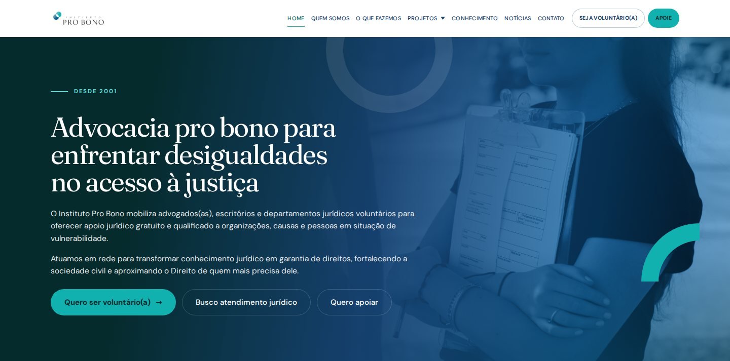
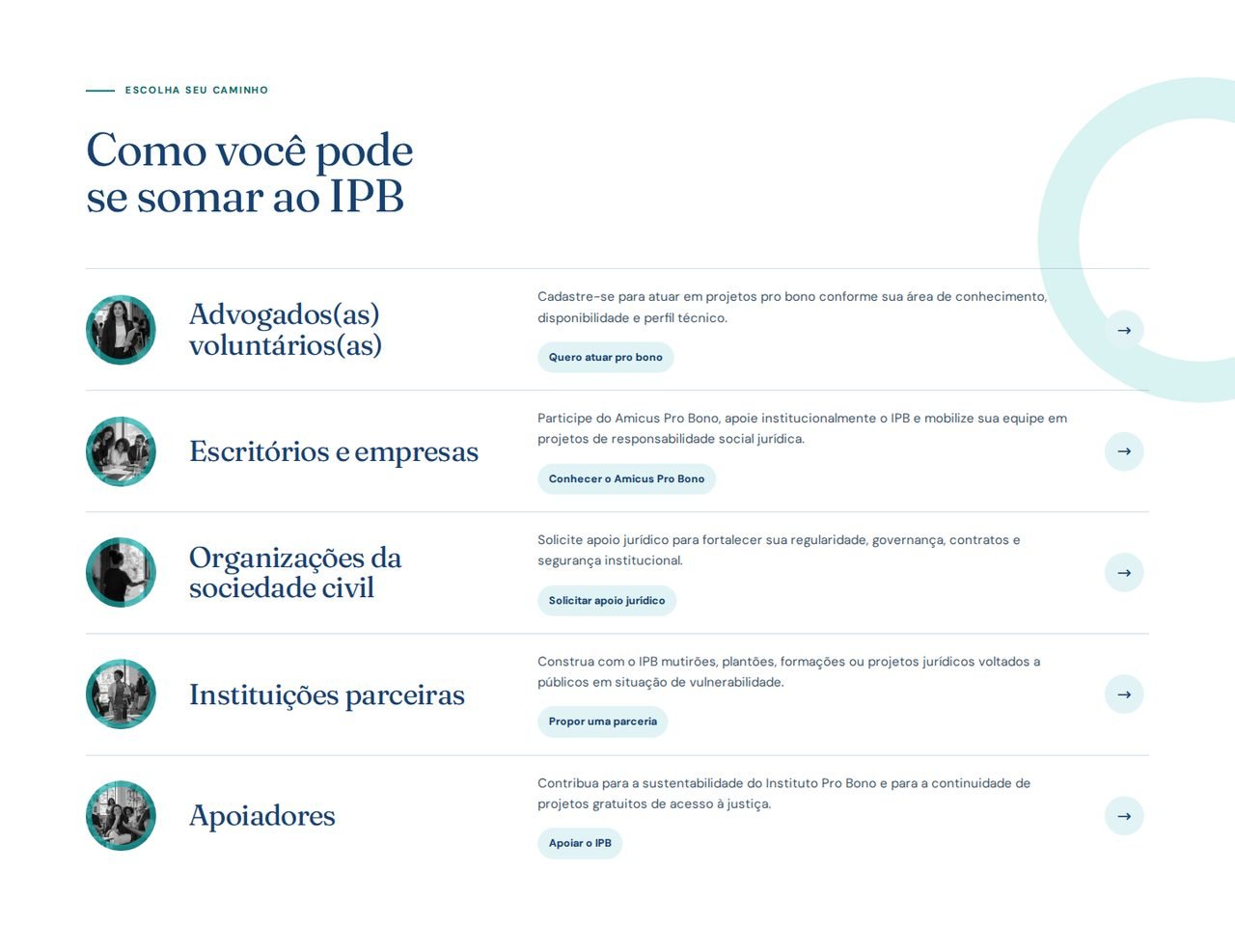
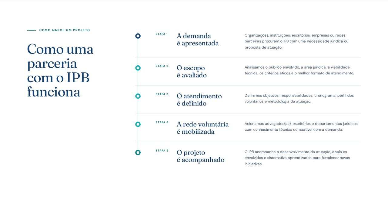
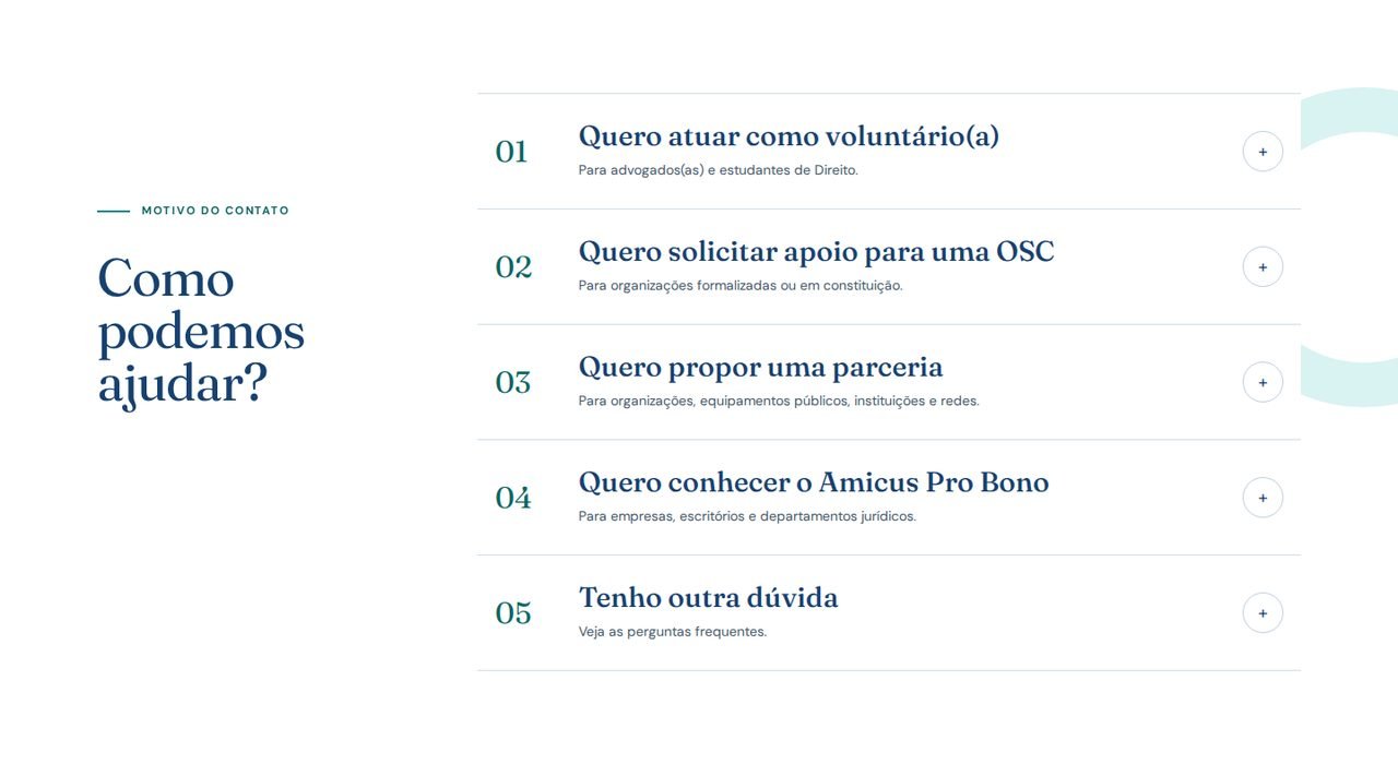
The previous site organized content well but felt flat: a simple hero, direct imagery, clean cards. The institute brought two reference screens, Civil Society and Individuals, which it had created itself at a much higher level of finish.
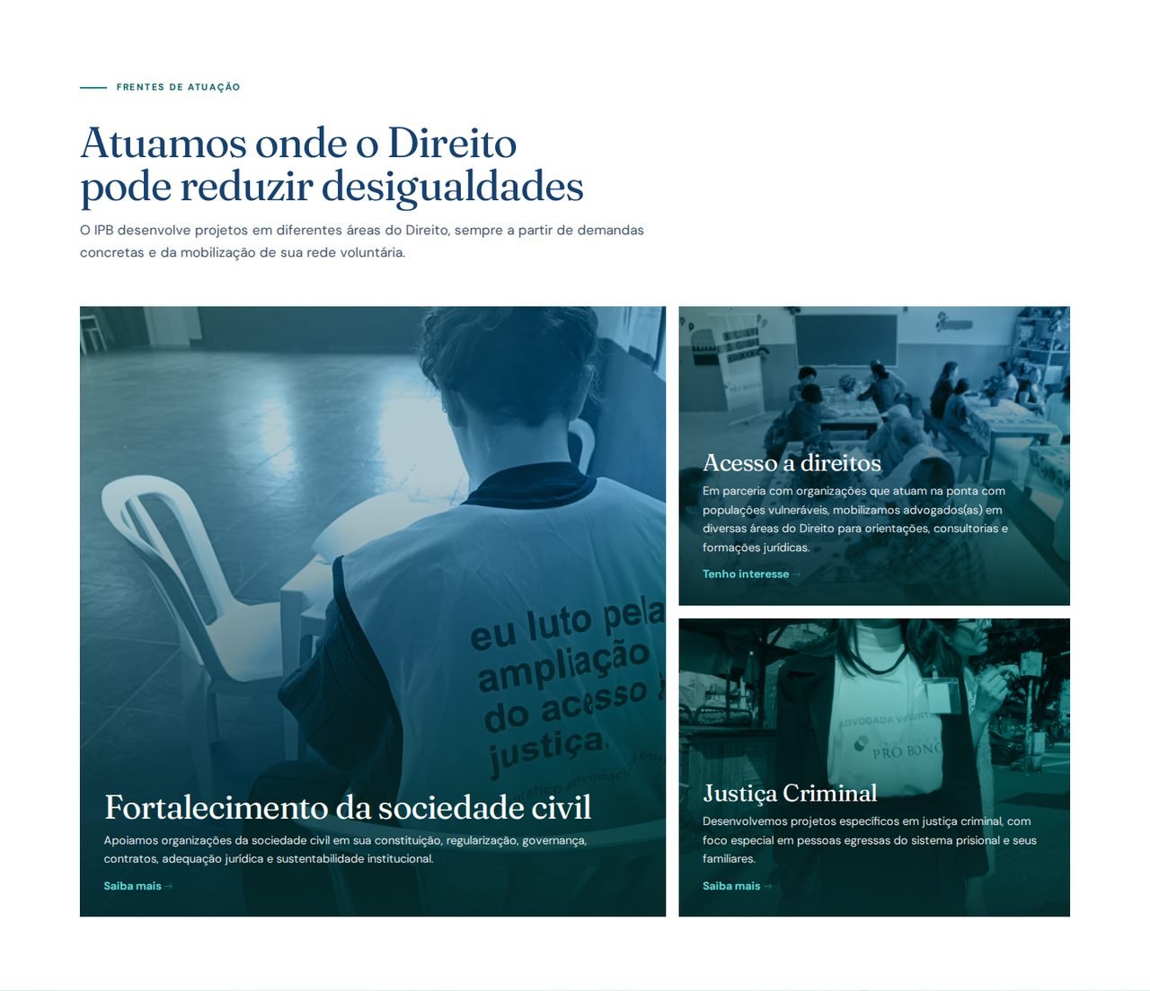
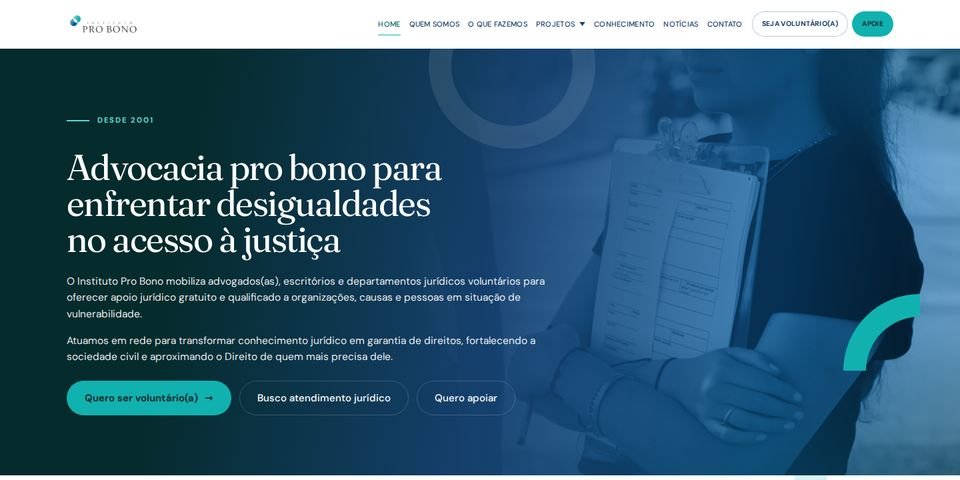
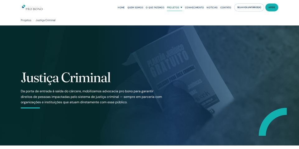
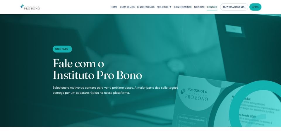
Rather than treating them as two pages to copy, I read them as a system and cataloged what repeated: duotone photography, cards floating over the hero, overlapping circular shapes in outline and fill, paper texture, pill labels, custom icons on each card, highlighted number blocks and decorative arcs. Eleven kinds of graphic element, a dual typography (editorial serif with a sans) and a short palette of blues and teal.
That changed the nature of the work. The most expensive part, inventing a visual language, was already done. What remained was extracting the rules and applying them to the other nine pages without the result turning into a stamp. So the path was to design one full page first, Get involved, to fix the rules, and only then spread them.